Sales Dashboard Design for Salesforce and HubSpot
Every metric on your dashboard must drive a decision this week.
A sales dashboard is supposed to be a command center. One screen, and it tells a rep what to do next and tells a manager where the team stands. Somewhere along the way, a lot of dashboards quit doing that job and turned into a trophy wall instead: rows of metrics that look busy, feel important, and change nobody's behavior on a Tuesday morning.
I've watched reps open a dashboard, stare at it for four seconds, and then go ask a coworker what's actually going on. That's a design problem, and it's usually one of the same four culprits: too many metrics, the wrong metrics, a layout that buries the one number that matters, or data that doesn't connect to any decision a person actually has to make this week.
The stakes aren't small either. Research on sales professionals consistently finds that navigating inaccurate or incomplete customer data ranks among their top challenges. A messy dashboard piles on top of that. And Xactly Insights found roughly 70% of B2B sales reps missed quota in 2024. How much of that miss is a selling problem, and how much of it is just a visibility problem, teams not seeing the signal in time to do anything about it?
So that's what this piece digs into. First, the design principles that hold up no matter what software sits under the hood. Then the platform mechanics, Salesforce and HubSpot specifically, that decide whether those principles survive contact with an actual build.
Choosing the KPIs that belong on a sales dashboard
Here's the one rule I won't budge on: every metric on the dashboard has to connect to a decision someone makes this week or this quarter. If a number doesn't change what a rep or manager does next, it's just decoration. Expensive decoration, usually.
That rule kills a lot of favorites fast. Raw email sends. Total meetings booked, with no mention of how many actually turned into something. Pipeline value sitting there with zero sense of whether it's moving or stuck in the mud. These numbers look great on a slide in a QBR. They don't move anyone to act differently the next morning.
Try this test on anything you're tempted to add: imagine the number comes in terrible this week, then imagine it comes in great. Would anyone do anything differently either way? If the answer is no, cut it.
Once you run that filter, three KPIs tend to survive for most sales teams:
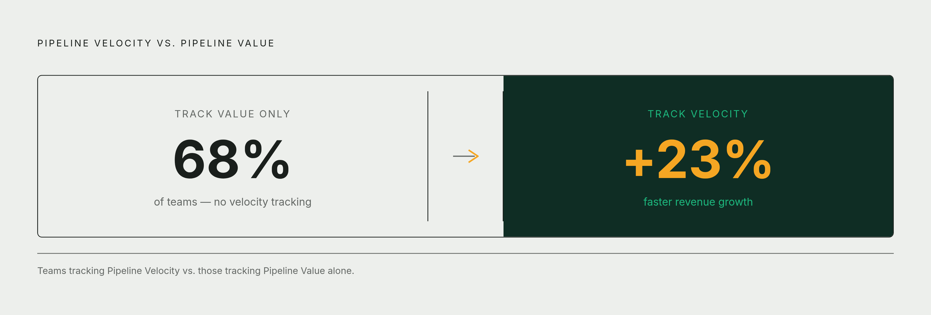
- Pipeline Velocity. This predicts revenue instead of just describing where things stand right now. Optifai analysis found 68% of teams still don't track it. That's a real miss, because the same study found teams tracking Velocity saw 23% faster revenue growth than teams stuck on Pipeline Value alone.
- Win Rate. Tells you how good the selling motion actually is. Break it out by stage and it'll show you exactly where deals go to die.
- Quota Attainment. The scoreboard number. Only really useful sliced by rep and by period, because "the team hit a strong number" can hide three reps far below target just as easily as it can mean everyone's fine.
Once those three are solid, layer in the supporting cast: average deal size, time to close, stage distribution, conversion rate by stage. Fine additions. They shouldn't fight the big three for top billing.
A rep and a sales director should not be looking at the same dashboard. A rep cares about their own pipeline and their own activity. A director cares about pacing, forecast accuracy, and which region is quietly falling behind. Try to build one dashboard for both and you end up serving neither one particularly well.
Universal design principles that make any dashboard readable and actionable
Good KPIs on a bad layout is still a bad dashboard. Design here is the difference between a signal and noise.
Eyes move in predictable patterns across a screen, roughly F-shaped or Z-shaped. Your most important number, the one that summarizes everything else, belongs top-left. Size matters too: your primary revenue metric should dominate the page, not sit shoulder to shoulder with six other charts pretending to be equally important. Color needs some discipline as well. A rough 60-30-10 split works: 60% for backgrounds and major elements, 30% for secondary charts, and 10% held back for accents and alerts, things that actually deserve a second look.
White space isn't wasted space, it's doing work. Group related items, give sections room to breathe, and you cut down on how hard someone has to think just to read the page. A cluttered dashboard gets read less, because people figure out fast that scanning it isn't worth the effort.
Match the chart to the data, not the other way around. Comparisons, compositions, distributions, trends over time, each one wants a different chart type, and picking wrong buries the insight instead of showing it. Edward Tufte and Cole Nussbaumer Knaflic have spent careers pointing at the same mismatch over and over: pie charts trying to show a trend, bar charts trying to cram in a part-to-whole story across a dozen categories. Pick the chart that answers the question, not the one that looks nicest in a screenshot.
Alerts should be rare. Save them for things that are truly critical, a KPI crossing a real threshold, a deal gone quiet, an actual anomaly. Flag everything and pretty soon nothing gets noticed.
Refresh rate should match how often the decision actually gets made. Real-time data feels good, but it isn't automatically better. A weekly pipeline review doesn't need a screen updating every sixty seconds. When the refresh outruns the decision cycle it's supposed to support, all you've added is noise dressed up as precision.
How Salesforce dashboard architecture shapes what you can build
Salesforce dashboards are, underneath, displays of reports. That single fact explains most of what goes right and wrong with a Salesforce dashboard: the dashboard is only ever as good as the reports feeding it. Bad report, bad dashboard, no matter how nice the chart looks on top.
Dashboards pull from Opportunities, Accounts, Leads, Contacts, and custom objects, so there's plenty of raw material to work with. But the report layer underneath still has to be built right first.
Salesforce gives you two dashboard types worth knowing apart. Standard Dashboards show the same view to everyone, which is fine for a leadership scorecard where everyone should be looking at identical numbers. Dynamic Dashboards adjust based on who's logged in, which is the right call for a rep-level view where "my pipeline" needs to actually mean my pipeline and not someone else's. Dynamic Dashboards 2.0, landing in 2025, pushes this further, adjusting in real time by role, device type, and access level.
Here's where it gets tricky, though: permissions. Salesforce runs a five-layer permissions model, dashboard folder sharing, report folder sharing, object-level permissions, field-level security, and record-level access through role hierarchy and sharing rules. Miss one layer and a user stares at an empty dashboard, wondering what's broken. Nothing's broken, usually. It's just one layer of access nobody remembered to check.
As of Spring '24, component types include charts, tables, metric cards, gauges, plus text and image widgets. Text and image components let you annotate right where someone's looking, explain what a number actually means, instead of making people guess. Looking ahead, Summer 2026 brings brand color palette support (so charts inherit an org-wide theme) and Einstein Semantic Layer integration, which enables zero-copy queries into Snowflake and BigQuery through Data Cloud. That's a real shift for any team whose data doesn't live entirely inside Salesforce.
Worth a mention: Spotify Advertising rebuilt its B2B sales process on Sales Cloud Einstein, pairing pipeline dashboards with Opportunity Scoring to prioritize leads. It's a useful example because it shows dashboard design and AI scoring built as one system, not two separate projects bolted together after the fact.
Salesforce's Einstein AI layer and where it adds real dashboard value
Einstein is Salesforce's AI layer, and it touches dashboards in a handful of specific ways.
- Einstein Copilot (2025) suggests KPIs, writes report summaries, flags anomalies in the data.
- Einstein Lead Scoring ranks leads by likelihood to convert, turning the dashboard from "here's how many leads exist" into "here's who to call first."
- Einstein Opportunity Insights flags which deals are most likely to close and suggests next actions. Closer to a to-do list than a status report at that point.
- Einstein Prediction Builder lets teams build custom AI models (churn risk, product demand) without writing code.
- Einstein Voice lets an executive just ask about pipeline trends out loud instead of hunting through report menus.
Tableau Einstein, launched Spring 2025, extends this from the data lake all the way to the point of consumption, with AI-generated insights showing up inside the workflow someone's already in, rather than a separate tool they have to remember exists.
None of this is free. Einstein Analytics runs $100 to $175 per user per month, which deserves a real question attached to it: which of these features actually change what a rep or manager does every single day, and which ones look great in a demo and then quietly go unused three weeks after the trial ends? Buy the first category. Skip the second.
An AI layer is only as good as what's feeding it. There's a reason tools exist that sit alongside the CRM and log activity or draft updates automatically, Next Step, for instance, uses autonomous agents to log updates and capture commitments for rep review, so the underlying data stays current. Einstein's predictions are only as sharp as the data behind them, and a dashboard, however smart it looks, sits downstream of a pipeline. If reps aren't logging activity consistently, no amount of AI polish fixes that at the display layer.
How HubSpot dashboard architecture differs and what it trades away for simplicity
HubSpot starts from a different foundation. Dashboards pull straight from CRM objects, Deals, Contacts, Companies, Tickets, and update the second a record changes. There's no separate report layer sitting in between the way Salesforce has one. That tight loop between CRM and dashboard is HubSpot's real structural advantage.
Most HubSpot sales orgs end up building three dashboards:
- A daily focus dashboard for reps first thing in the morning: open deals, tasks due, next actions.
- A pipeline health dashboard: stage-by-stage distribution, conversion rates, velocity signals.
- A leadership pacing dashboard: quota attainment pace, forecast versus target, team rollups.
Out of the box, HubSpot natively tracks deals created, deals closed, pipeline value by stage, close rate, new contacts, email activity, calls logged. That covers a lot of ground without anyone building much of anything custom.
The trade-off shows up once you hit the tier wall. Custom reports, dashboard filters by team or region, deeper segmentation, all of it requires Sales Hub Professional or Enterprise. Free and Starter are meaningfully limited, which is worth knowing before you plan a dashboard strategy around features you don't actually have yet. Permissions, by contrast, are dead simple: private, shared with a team, or fully visible. Easy to administer, but also clearly less granular than Salesforce's five-layer setup.
One design choice deserves real credit here: HubSpot leans into gamification on its activity dashboards. Daily task completion tracked over a rolling two-week window. Green highlighting when a rep hits a daily target. A quarterly leaderboard sitting right there in plain view. That turns a reporting screen into a motivation tool, one Salesforce can replicate only after a lot more custom configuration to get there.
HubSpot's attribution reporting deserves a mention too. It traces every touchpoint before a deal closes, so a manager can see which channels actually drive revenue instead of guessing based on vibes. Multi-pipeline forecasting shows up at higher tiers, and it's a real asset for teams running more than one sales motion at once.
Salesforce vs. HubSpot dashboards: where each platform has a real advantage
This isn't a winner-take-all question, whatever the vendor decks want you to believe. It's a fit question, and the answer depends on where your team actually sits.
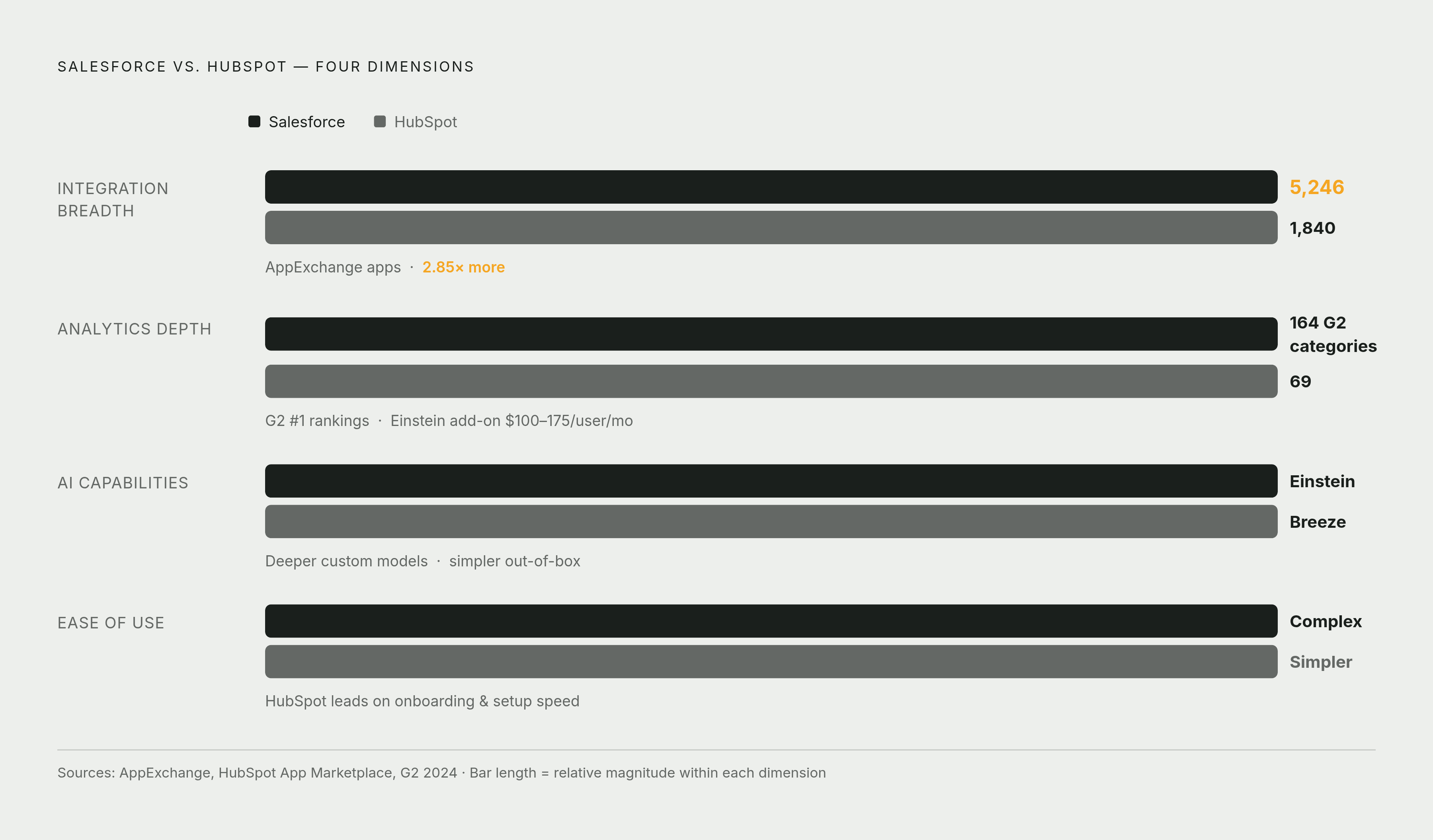
Analytics depth. Salesforce is built for complex, multi-object reporting and cross-cloud data, and configurable enough to match. HubSpot's reporting is solid, more than enough for most SMB and mid-market teams, but it hits a ceiling once the data model gets complicated or the org scales past a certain size.
Ease of use. HubSpot's clean, opinionated layout gets you to a working dashboard fast, no dedicated admin required. Salesforce has a steeper climb, but the climb pays off once complexity shows up. The catch: someone has to own the configuration, and not every team has budgeted for that person.
AI capabilities. Salesforce's Einstein and Agentforce stack is a mature, predictive and generative layer. The 2024 Gartner Sales Force Automation Magic Quadrant recognized Salesforce for the flexibility Agentforce gives sales ops admins. HubSpot's AI strategy is lighter by comparison, and that same Gartner report flagged a specific caution around HubSpot's AI and ML roadmap.
Integration breadth. As of March 2025, Salesforce's AppExchange lists 5,246 integrations. HubSpot's App Marketplace lists 1,840. For a team running a complicated or non-standard stack, that gap matters.
As a rough proxy for overall maturity: Salesforce ranks first in 164 software categories on G2, versus 69 for HubSpot, as of March 2025. Not a dashboard metric on its own, but it says something about the depth sitting behind the product.
So, plainly:
- HubSpot fits SMB to mid-market teams that want fast setup, a clean interface, and a tight CRM-to-dashboard loop without a lot of admin overhead.
- Salesforce fits mid-market to enterprise teams that need configurable reporting, multi-cloud data, and an AI layer built to scale alongside them.
There's a crossover zone worth naming too. Growing mid-market teams often start on HubSpot and migrate to Salesforce once complexity demands it. Build your dashboard logic around portable KPIs, not platform-specific features, and that migration will hurt a lot less.
Building a dashboard that reps actually use every day
Here's the part that stings a little: most dashboard failures aren't design failures at all. They're workflow-fit failures. A dashboard reps don't check is just an expensive report nobody reads.
The real test is simple. Does the dashboard answer the questions a rep actually has at 8am, before the first call of the day? If it doesn't, the KPIs and the color scheme don't matter much.
That's why role-specific dashboards tend to beat one universal dashboard.
- Rep view: my open deals, my tasks due today, my quota pace, my next actions.
- Manager view: team pacing, individual attainment, pipeline health by stage, deals at risk.
- Executive view: aggregate forecast, win rate trend, revenue versus target by period.
And then there's the discipline that's genuinely hard to hold onto: keep it to one screen, no scrolling. Every widget competes with every other widget for a rep's attention, and attention is the scarcest thing on that screen. A good rule to live by: if a metric isn't reviewed often enough to change a decision, it doesn't get a permanent seat on the dashboard. Move it to a report someone can pull when they actually need it, and let the dashboard stay what it's supposed to be. A command center. Not a museum of numbers nobody's looking at.